
|

|

|

|

|

|

|
|
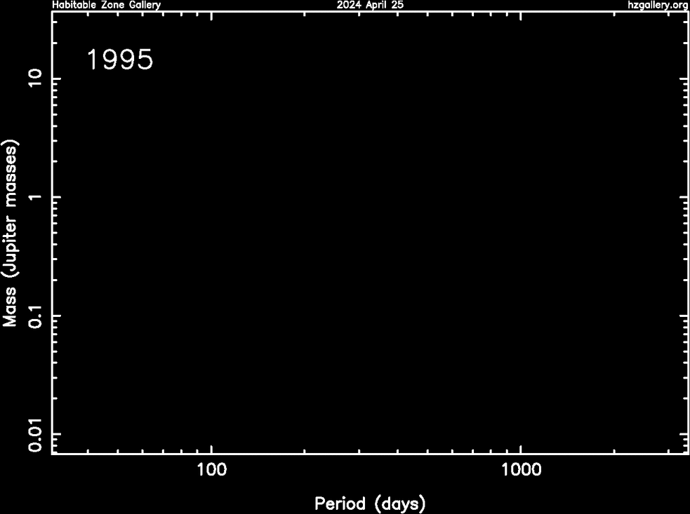
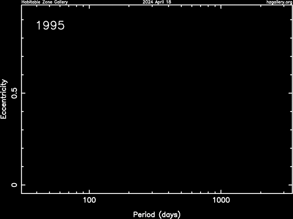
The below two figures indicate known exoplanets which enter their optimistic Habitable Zones. The size of the points linearly increases with the percentage of time spent within the Habitable Zone. The plots show the mass of the planet (left) and orbital eccentricity (right) versus the orbital period. Click on the images to view the animated versions, which show how our knowledge of Habitable Zone planets has increased with time. |
|
|
|
|
|
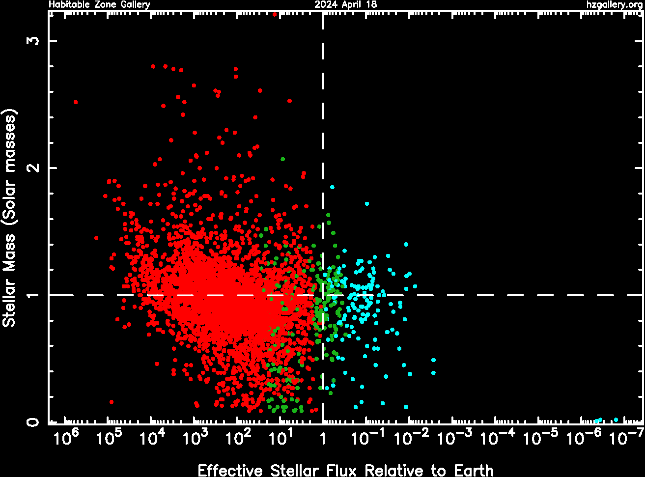
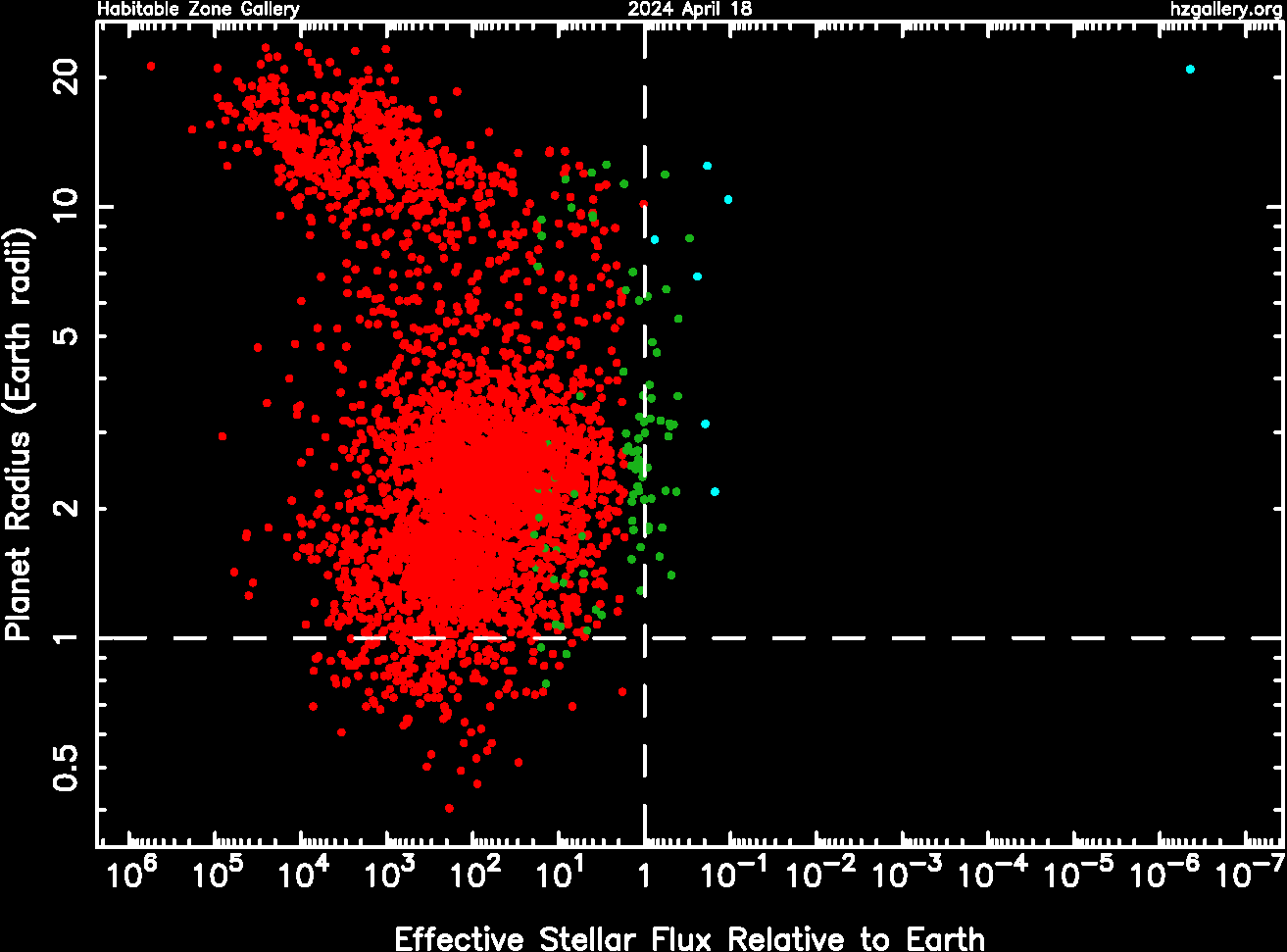
The below two figures show the dependence of effective stellar flux received by the planet on stellar mass (left) and planet radius (right). The green points are those planets which spend more than 50% of their orbital phase within the optimistic Habitable Zone. Red and blue points are planets interior and exterior to the Habitable Zone respectively. The dashed crosshairs show the location of Earth. Click the images to view the larger versions. |
|
|
|
|
|
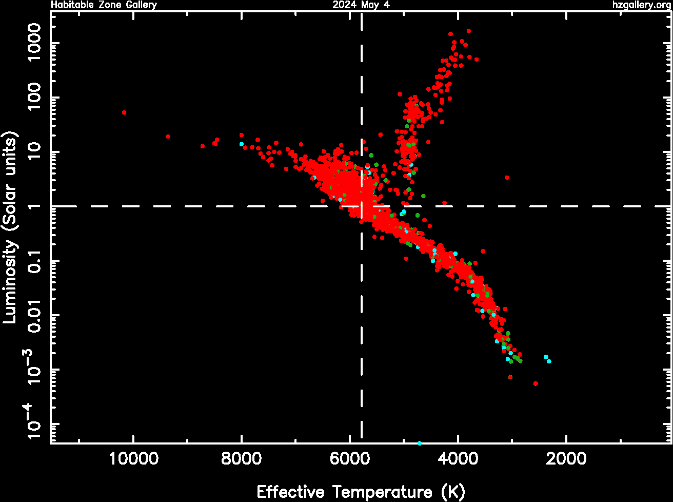
The below figures show a Hertzsprung-Russell (H-R) diagram (left) and a histogram of the discovery rate (right). The green represents planets which spend more than 50% of their orbital phase within the optimistic Habitable Zone. Red and blue represent planets interior and exterior to the Habitable Zone respectively. The dashed crosshairs in the H-R diagram show the location of the Sun. Click the images to view the larger versions. |
|
|
|
|